Off the Shelf
 |
In the pursuit of knowledge, today’s students sometimes want to put their feet up and lounge with a café latte, while they express fresh epiphanies on a blog or live Internet chat as robotic arms pass research materials to them.
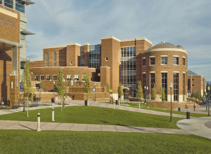
The scene’s comfortable, Jetsonian appeal is what designers of the University of Nevada’s Knowledge Center, in Reno, had in mind when drawing up plans for the 295,000-square-foot, $74 million facility that was completed in August 2008.
School administrators wanted a building that would anchor activities on the north end of the campus and replace the old library, which was considerably smaller in scale.
The architectural team composed of Hershenow + Klippenstein and Dekker/Perich/Sabatini designed the exterior of the facility with red brick to conform to the traditional look of other buildings throughout the campus, but the interior is far from status quo.
The center is a tapestry of technological innovations and creature comforts designed to captivate students and familiarize them with the digital tools they will encounter and utilize after graduation.
Recent studies say students and professors must put a greater emphasis on IT skills training in universities and employers say IT skills will be a necessity for job seekers during the next five years. The technological features within the knowledge center were designed to speak to these concerns, according to planners.
|
For more photos of this facility, download the digital edition here. |
On the ground floor, there is a lab for developing multimedia projects that includes soundproof production rooms for creating and editing audio and video content; a digital projects lab with mobile furniture, white boards, plasma screens and a raised floor for wiring; video conferencing rooms with plasma screens; and digital classrooms with dual or triple-projection for instructional or access-grid node use, video systems and wireless audio.
Extending through the three floors of the five-story building is a 13,000-square-foot automated storage and retrieval system that compacts 20 years of library collection growth in 45 feet of vertical storage. Materials are referenced in an online catalog and retrieved and re-shelved by a robotic mini-crane system.
“There are only about 20 of these libraries in the world,” says Julie Walleisa, architect at Dekker/ Perich/Sabatini. “It is a really smart system.”
 |
|
An automated retrieval system includes 45 feet of vertical storage at the library. |
The robotic system can re-shelve materials in different locations based on frequency of use or subject matter relevancy. The foundation for the storage and retrieval system involved 12 million pounds of concrete and required the largest continuous concrete pour in northern Nevada history, according to designers.
The building also has the distinction of being the second largest public works project in the history of the state.
Nontraditional Spaces
The more traditional spaces in the library are laden with digital accents as well. Study and collaboration rooms on each floor are equipped with plasma screens. Wi-Fi networks cover much of the building and power outlets at study tables and carrels accommodate laptops throughout the building. Public computer stations are also provided on every floor.
The spaces on each floor are arranged to progress from an active computing area on the first floor, and open public spaces on the second floor, through quieter areas of focused collections and reading rooms, to an entire floor of quite study on fifth floor.
“People can hang out on the first floor and if they want a quiet place to study they can go farther up,” Walleisa says.
|
|
|
Access to computers is provided throughout the knowledge center. |
In direct defiance of disciplinarian rules at traditional libraries, the center also includes a café. Food and drinks are allowed throughout most of the building, underlining the relaxed mood and nontraditional spaces the project team worked to design.
“I was floored to see a pizza delivery guy walking through the library, but it shows that people are using the place as we intended,” Walleisa says.
Spaces reserved for displaying artwork are infused into many areas of the building. An art gallery on the first level has locking display cases and an art hanging system to support rotating exhibits of rare books, art, photographs and manuscripts.
Art and Light
Art displays are planned for several other highly visible walls at the west stairs and at the sides of an atrium, with accent wall colors and lighting coordinated to best display artwork.
In addition to orienting visitors to the building’s layout, the atrium provides daylighting throughout the facility. While natural lighting was considered during the planning, computer modeling was used to ensure light would infiltrate at the bottom floors without overwhelming the upper levels.
“Tremendous emphasis was given to daylighting and acoustics throughout the building, as well as green design and energy modeling,” Walleisa says.
Other energy-saving features include an automated lighting control system, skylights above open workspaces for staff and a curtainwall with shading devices and light shelves.
“This building is supposed to last for 100 years, and I think we designed something that lives up to that,” Walleisa says.
|
PRODUCT DATA Facility Name: Mathewson-IGT Knowledge Center, University of Nevada, Reno PROJECT DATA Construction Materials Furniture/Equipment Carpet/Flooring Lighting Security/Fire Safety Washroom Equipment/Supplies HVAC/Controls Courtesy of Hershenow + Klippenstein Architects |

