Comfortable Furniture Ties Together Modern Spaces
 WEBSTER GROVES, Mo. — Webster University students are enjoying their third semester of an entirely different level of collaborative learning at the school’s 94,323-square-foot East Academic Building, which became fully occupied in March 2012.
The three-story, $29 million structure features an intuitive design with conference rooms and teacher offices for the George Herbert Walker School of Business and Technology located on the top floor, while classrooms and open public spaces share the bottom two floors. As the first academic building constructed on campus in 30 years, it was designed to create flexible and customizable spaces both in its public lobby, where students can meet to study or converse during downtime, and its classrooms. Webster, a private university, paid for the building with money from a four-year, $56.2 million capital campaign, intended to help the school fulfill a new master plan.
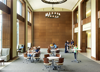
The building’s lobby was designed to create a vast and impressive open space, broken up by strategically placed groupings of furniture, allowing students to gather in small or large groups, creating a sensation of sharing private conversations within strikingly large open areas. The theme of breaking up large areas with comfortable and easy to rearrange furniture was implemented throughout the entire project.
The building was designed through a collaborative effort involving New York firm Robert A.M. Stern Architects and Mackey Mitchell Architects, based in St. Louis, with Paric Corporation, based in O’Fallon, Mo., serving as the construction manager. Local St. Louis firm Spellman Brady & Company served as the interior designer on the project, and were able to create cozy spaces within large areas at the university, while ensuring that classrooms and office spaces were functional and aesthetically pleasing.
Bruce Hentges, vice president of Spellman Brady & Company, explained the school was looking to take itself in a new direction with this building, rather than attempting to replicate the interiors of existing structures on campus.
Lara Slavkin, designer on the project for Spellman Brady & Company, said the idea was “to go for a more sophisticated pallet, not geared toward school colors or any kind of theme.”
The entire building was designed with input from a 15-person steering committee, which met regularly and featured members representing the school’s administration, facility services, faculty, students and technical services.
Hentges explained his company held a two-day furniture fair on campus, bringing in over 100 pieces of furniture to be evaluated by students and faculty, featuring various pieces for each type of room in the structure. He added that 164 people participated in the exercise. Hentges said the participants seemed to really enjoy the process and get a sense of involvement with the project.
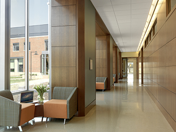
 Slavkin explained that one of the signature features of the building ended up being the long corridors, which were broken up by small alcoves and filled with individual lounge chairs along with tandem seating. The areas include power outlets as well, to let students charge their portable devices while studying or taking a break between classes. The redesign of this area transformed the space from a busy hallway to a place where students can utilize for studying purposes and also social interactions. Slavkin selected Achella seating provided by Chicago-based Arcadia.
Describing the corridors, Slavkin said, “The architecture had these niches created with windows, high ceilings and wood paneling, and we were able to create these smaller intimate lounge seating groupings that have actually been utilized by the students quite a bit when we visited after the fact.”
Visitors entering the lobby are instantly struck by the massive two-story clearing, with a wall of light flowing down from the upper level onto a picturesque staircase surrounded by oak paneling. Slavkin selected high back chairs for the lower level of the lobby area, but placed low back chairs on the second level to avoid obstructing the view from below, allowing visitors to enjoy the architecture and natural lighting. The project featured a massive amount of natural lighting, as part of the university’s quest to attain LEED Silver certification, which as of press time, is still pending.
Slavkin said she enjoyed using the natural light to accent her work, explaining, “We really just kind of played off of that and brought these seating arrangements to those windows so when you were sitting in these spaces, even though you were indoors, you were enjoying the exterior.”
The building’s commons features flexible workspaces with tables that adjust in height, allowing students to stand or sit depending on their preference. The Freestyle adjustable tables were provided by Milwaukee-based Surface Works.
The classrooms were intended for a wide array of subjects and classes. The rooms were arranged in a variety of styles, with most of them designed to be easily rearranged or reorganized.
The classrooms all contain Focus chairs by SitOnIt, based in Cypress, Calif., which feature comfortable cushions with mesh backs. Seating options with or without arms were sprinkled throughout these rooms, accommodating different body types and personal preferences.
“We wanted to have something that was size appropriate, comfortable, that made a statement within the classroom that complemented the architecture. That was really one of the signature pieces from a furniture standpoint and Webster made a commitment to invest in the student and this was a significant investment, just the chair itself,” said Hentges.
Technical labs, a brand new type of classroom space at the university, featured groupings of tables around television monitors, allowing students to break up into groups, work on a presentation, and show their finished product to the entire class on the main screen.
The more standard classrooms were designed for more traditional learning environments, with rectangular tables that could be arranged all facing the teacher for a lecture-style experience, or placed in a large rectangle in a study group setting.
The only learning spaces without furniture that could easily be rearranged were the tiered classrooms. These classrooms were set up in a small amphitheater style, with two different levels in the floor allowing students to surround their instructor in a half-ellipse formation. A projector was positioned in the middle, facing a large whiteboard, which doubled as a screen for the professor to lead the class through presentations.
The dean’s office and reception area features heavy wood tables and comfortable chairs, along with abundant natural lighting and large comfortable chairs.
Offices for instructors in the school of business followed the theme of flexible design. None of the usable features were fixed to the wall, allowing professors to create whatever type of environment they want while visiting with students. A few of the office spaces feature IdeaPaint whiteboard surfaces on the walls, allowing teachers to draw visual aids, or demonstrate equations while explaining principle to students.
The classrooms, offices and boardrooms all feature carpet tile. Slavkin said this choice was made because carpet tiles can be replaced individually when damaged, while broadloom carpets would have a visual seam when a section was cut out, meaning the school would either have to accept a less than ideal visual blight or replace an entire room’s carpet.
Hentges said one conference room, now being used as a boardroom for the university, stands out from the rest. The epic space features windows on three sides, a high ceiling and dark wood furniture. The centerpiece is a massive wooden table, wired for electrical and Internet functionality.
