Interior Design Trends Defining Schools This Year
By Kerrianne Wolf
Interior design is constantly evolving with the development of new teaching methods. There are three key design trends you will see more of in 2018: open, welcoming and secure entrances; flexible spaces; and decorative themes that create a sense of ownership and belonging. It goes without saying that safety and security are also at the forefront of interior design.
Open, Welcoming & Secure Entrances
Have you ever arrived at a school and wondered where the main entrance was? After entering the school, have you wondered where to go next? Schools designed in 2018 will surely negate those experiences by providing a clear, open, safe and welcoming entrance — not only into the building, but also upon approach to the site.
It all begins in the parking lot with signage for vehicles, busses and visitors, followed by appropriately placed signage to guide visitors to the school’s main entrance. Upon entry into the school, visitors should receive that same warm welcome. This can be achieved with controlled access via a buzzer and an open, airy, well-lit and comfortably furnished space that displays the school colors by way of paint or banners. Adding student artwork to the space creates a sense of ownership.
The warm welcome can be extended into the facility through the use of safety glass and skylights that convey a sense of visibility and security. It is imperative that this space can be seen from other parts of the facility, including the second floor, and vice versa.
Flexible Spaces

Photo Credit: RRMM Architects
The types and sizes of spaces within a school facility must be flexible — it’s that simple. This includes a typical classroom, which is approximately 900 square feet, as well as large, open spaces such as extended-learning areas, lecture halls and commons, and small, intimate spaces for teamwork and collaboration. Since play is a key part of student development, each of these spaces should be designed with work and play in mind.
Informal spaces must be flexible as well. Examples of informal spaces include hallways and stairwells. In addition to serving as circulation spaces, they can serve as gathering and presentation areas. For that reason, hallways and stairwells should be wide enough to accommodate seating.
A final flexibility factor to keep in mind is being able to serve different grade levels over time. While a facility might be designed for 750 middle school students initially, it should be able to accommodate elementary or high school students in the future.
Decorative Themes
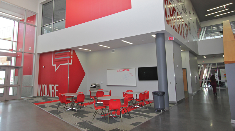
While nearly every square foot of public schools must be practical, useful and functional from a taxpayer’s point of view, today’s facilities should also create a sense of beauty, ownership and belonging. There are several examples of this throughout the country. The Dan Dipert Career + Technical Center in Arlington, Texas, introduces geometric design and school colors at the main entrance and continues them throughout the facility. The walls and furnishings mimic the entrance by incorporating angles, curves, and a gray and red color palette. Inspirational quotes cover several walls.
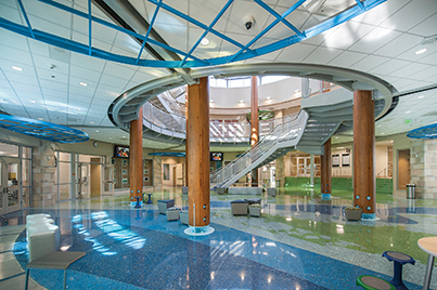
Another example is Old Donation School in Virginia Beach, Va. The school’s interior reflects the exterior by using natural colors such as blue to represent water, green to represent vegetation and brown to mimic trees. The use of glass in the center of the facility allows the natural daylight to stream in and infuses the area with sunshine. Indeed, glass brings the outdoors in.
Since students often learn through self-exploration and discovery, it’s our job to give them welcoming, flexible and beautiful spaces to spark their interest and creativity while keeping them safe and secure.
To read the entire article, check out the March/April issue of School Construction News.
Kerrianne Wolf, REFP, is the educational specifications specialist for Cooperative Strategies, a national company that assists educational agencies in providing quality facilities to students.

